THE CHROMATIC CIRCLE
Chromatic circle or color wheel
The chromatic circle is used for classification and for understanding color theory and is generally used to study pigment-colors.
A chromatic circle is a type of wheel on which different colors are placed, corresponding to the three basic degrees of the chromatic universe: primary, secondary and tertiary. The primary colors are three in number: cyan (blue), magenta (red) and yellow. In this circle also appear secondary colors, represented by green, purple and orange. Finally, tertiary colors arise from the marriage between a primary color and its complementary color. In order to determine the complementary colors, the diametrically opposed colors such as yellow and violet are marked in the circle.
¿What is the chromatic circle for?
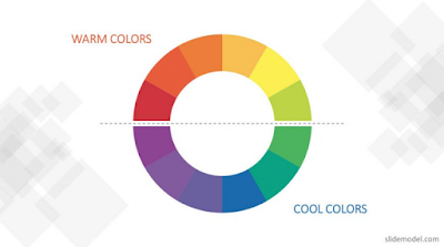
The chromatic circle or color circle is used to identify a range of tones, as well as to indicate their concordance or possible cohabitation. In this circle, we also determine the cool colors (from green to purple through blue) and the warm colors that are available from red to orange to shades of yellow .chromatic circle.
Therefore, the traditional chromatic circle has twelve colors. With this pattern, half of the chromatic circle is composed of warm colors, with the opposite half of cold colors. When colors are organized in this way, artists can see the relationships between contrasting and harmonious colors around the wheel. Artists often have a different aesthetic in mind when they start working. Knowing how to use a color wheel can help you get there.
¿Who invented the chromatic circle or color wheel?
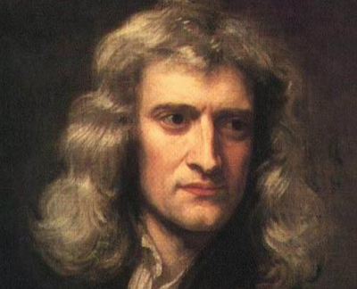
The renowned mathematician Sir Isaac Newton invented the first color wheel or chromatic circle. While studying the white light reflected in the prisms, he noticed that the light reflected a spectrum of colors. Noting the different tones, he believed that the rainbow of colors shared a harmonious relationship. Following that line of thought, he compared the tones with the music to discover the harmonious relationship between each tone. He identified each nuance with a corresponding musical note. Then they organized those musical notes into a square and, finally, they placed the colors on a rotating disc to see how they interact with each other visually. And that is the story of the ideation behind the first color wheel. (Curious fact: when you turn the color wheel, the human eye will only see white when the colors are mixed).
A color wheel
Imagine designing a city. You have a busy intersection where a series of roads meet. A very common way for city planners to keep these roads organized is to organize them into a roundabout. In this circular system, the relationship between roads is easier to see. In fact, circles are a good system of organization in general. Artists commonly organize the colors into a circular pattern called color wheel, which can help them understand the relationship between these colors. It's like a colorful roundabout: you enter one point and exit another, depending on where you want your composition to go exactly.
Composition of the chromatic circle
The chromatic circle is a representation of the color spectra perceived by the human eye, in general it is represented by a circle in pizza slice format with the 12 colors that are perfectly arranged with three primary, three secondary and six third.
Primary colors
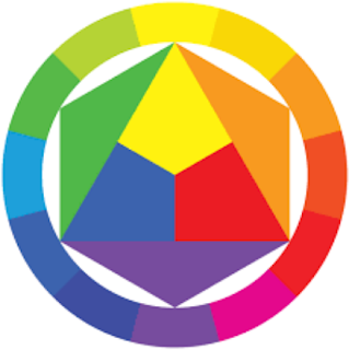
To make the chromatic circle, we begin with the three primary colors of red, yellow and blue. The primary colors are those that cannot be combined by combining other colors. To start making the wheel, we create spaces for red, yellow and blue that are evenly spaced, forming an equilateral triangle. Read more about primary colors.
Secondary Colors
The next set of colors on the color wheel are those that are created by combining equal amounts of primary colors, called secondary colors. Red and blue make violet, blue and yellow green, and yellow and red create orange. So, now we put spots for these three colors in the chromatic circle. Each one goes directly between the two primary colors used to create it. Read more about secondary colors
Tertiary Colors
We have six colors on our 12 color wheel, so we need six more. These last six are all tertiary colors, created by adding more primary color to a secondary color. For example, green is a secondary color. If we add more blue, we get a blue-green color. If we add more yellow, we get a yellowish green color.
Those are tertiary colors. In the color wheel, tertiary colors are between the primary and secondary colors used to create them. With that, we have 12 related color values in our color wheel.
Color combinations
Deciding which colors to use in a room can be difficult. Artists use different colors to create visual interest, while interior designers use color combinations that are pleasing to the eye.
Complementary Colors
Complementary colors are colors that face each other on the color wheel, such as red and green. This creates a high-contrast look.
Analog Colors
Analogous colors are colors that are side by side in the chromatic circle, such as blue-green, green and yellow-green.
Triadic colors
Triadic colors are colors on the color wheel that form a triangle. An example of a triadic color scheme is purple, orange, and green.
Warm and Cold Colors
The chromatic circle can be divided into two sections: warm and cold colors. Red, yellow and orange are the basic warm colors. These are added to rooms that are full of activities, such as kitchens. Blue, green and purple are the basic cold colors. These are often used in bedrooms and bathrooms because they make people feel relaxed.
The Evolving Color Wheel
Other people took the color wheel and expanded their ideas. Johann Wolfgang von Goethe was one of the first people to talk about how colors make us feel. One side of the color wheel, the colors red, yellow and orange, are known as the warm colors.
The colors blue, green and purple are known as the cold colors. Goethe described warm colors as the positive side because he thought that colors make you feel excited and happy. Cold colors are the negative side because they make you feel fainter and more relaxed.
Artists and interior designers use the color wheel to discover which colors look best next to each other. There are three primary colors on the color wheel: red, yellow and blue. You can't mix other colors to make these colors. The secondary colors, purple, green and orange, are obtained by mixing the primary colors. Red and blue make violet, blue and yellow green, and yellow and red orange. Tertiary colors are made by mixing colors.
Chromatic effects
- Monochrome: Corresponds to the range of tones of a color with shadows to light when mixed with white or dark with the obtaining of black addition.
- Tonality: It is the tonal range of a color that can be achieved in a process or gradient scale.
- Polychrome: Produced in a composition with a combination of more than three colors arranged separately.
- Hue: A characteristic that defines and distinguishes a color. Red, green or blue, for example, are shades. To change the hue of a color, another hue is added.
Chromatic harmony
Sometimes a work of art or communication material stands out and gets your attention, one of the reasons may be the use of a chromatic harmony well produced because patterns like this refer us to the beautiful.
But works like these need a deeper knowledge in relation to the study of color both to produce and create materials and options and harmonic color combinations.
Monochromatic harmony:
It is the variation of luminosity and saturation of a single shade of the chromatic circle.
Analog harmony
They are the 3 colors that remain together, one next to the other in the chromatic circle.
Complementary harmony
They are the colors that are located opposite in the chromatic circle, the complementary of a primary color will always be a secondary colors, and vice versa, the complementary of a tertiary will always be other tertiary.
Triadic harmony
There are 3 colors that have the same distance between them in the chromatic circle, forming an equilateral triangle. The primary colors are triadic, as well as secondary and tertiary.
Divided complementary harmony
They are combinations between a chosen color and the two colors neighboring its complementary color.
Complementary double harmony
They are two doubles of direct crossed Complementaries, interspersing a color. Also called by some tetrads.
Achromatic harmony
These are the so-called neutral colors: white, black, ashes and ivory. The colors located in the central area of the chromatic circle, which lose so much saturation that the original shade no longer appears.
Temperature of the colors
Warm colors
They are the colors that transmit heat, joy and light, such as yellow, orange and red.
Cold colors
It is characterized by the less vibrant, melancholic, peaceful common colors of green, purple and blue. Read more about cold colors.
Neutral colors
Black, white and grey, in all their shades, light or dark, form neutral colors. The other colors, when they lose their color due to excessive mixing with black, white or gray, also become neutral colors.
Neutral colors include white, grey and black. White is light without color, black is the absence of color and grey tones are the mixture of white and black.
Some indications on the symbolism of the colors
The color depends on the temperature of the light emitted on it and the way in which it is absorbed and reflected on a given surface.
The eyes will capture the electromagnetic waves that are reflected and depending on their wavelengths, we see different colors. In our brain, colors can awaken certain sensations and therefore each color brings a specific meaning. Read more about color meaning.
In spite of not having verified the scientific community each color has the capacity to pass some type of sensation like in the list to the bottom:
Blue
Blue is related to nobility and is usually used to transmit harmony, tranquility and serenity, cleanliness, water and productivity.
The meaning of blue is mainly associated with the feeling of peace, as well as white, but in a more subtle way. In dark tones it conveys security, confidence, success and power. Widely used in technology companies. Read more about blue color.
Green
This is the color most associated with nature and the feeling of hope, but is also related to concepts such as health, life, money, vitality and youth, balance, freshness, harmony, healthy things. Its use in science, medicine, ecology, tourism and organic food companies is quite common. Read more about green color.
Yellow
Used to pass the sensation of light and heat, yellow stimulates reasoning and creativity. It can also be used to represent optimism and joviality. Yellow encourages creation and communication, awakens joy, animation, entertainment. For attracting enough attention, it is used in traffic signs and also in shop windows. Read more about yellow color.
Purple
The meaning of the purple color is often associated with spirituality, refers to wisdom, fantasy, mystery. Purple is a color that calms and conveys well-being, so beauty products, body care advertisements and alternative treatments are frequent applications of this tonality. Read more about purple color.
Pink
It is the color of romanticism and delicacy, being more associated with the feminine world. The different tones may have different meanings, but normally this color is used to refer to love and innocence.
Pink in light tones expresses innocence, while darker tones inspire desire, affection and femininity. Widely used in products aimed at female audiences.
Red
This warm color transmits a lot of energy, passion and love. It is a strong color and therefore can often also be associated with power and violence. It is known for stimulating circulation and improving self-esteem.
It also expresses urgency, and that is why it is commonly used in the advertising of stores in liquidation.
Combined with yellow, it is widely used in the food segment, as in restaurants and fast food networks, as it stimulates appetite. Read more about red color.
Orange
It is created by mixing red and yellow and transmits joy and vitality. It can also mean success and prosperity.
The color orange represents an energetic, stimulating, young color. It encourages expansion, creativity, enthusiasm and optimism. Promotes change and dynamism. Widely used in the food, sports and leisure segments. Read more about orange color.
Brown
Considered the color of the earth, brown expresses safety, maturity, comfort and simplicity. In addition, it is also related to natural products and healthy lifestyle.
The symbolism of the brown color transmits sensation of tradition, conservatism, reliability, solidity, being enough used in furniture, companies of interior decoration, architecture.
Grey
This neutral color corresponds to stability, solidity and the absence of emotions. They are often used to represent sophisticated elements. Nevertheless, for some people, grey is associated with loneliness, depression and sadness.
Grey is a classic color that conveys elegance and respect. It is used in technology companies and in the automotive industry, because it also shows responsibility and professionalism.
White
It represents peace, purification, innocence and clarity. It is also recognized as a color that transmits calm and helps achieve balance.
White color in combination with other colors is harmonic, expresses peace, faith, light and purity. Commonly used in the segment of Medicine and Dentistry.
Black
The black color is obtained when the absorption of all the radiations of the solar spectrum takes place. The black color according to the context can represent sadness and mourning, but if well used transmits nobility, tradition, curiosity, superiority, power, professionalism. Engineering companies, law firms, cosmetics and luxury products often use that color.
Words looked for on the chromatic circle: the chromatic circle, chromatic circle that is, chromatic circle of colors, chromatic circle to color, chromatic circle colors, basic chromatic circle, images of chromatic circle, chromatic circle primary colors, chromatic circle of 24 colors, chromatic circle makeup, chromatic circle to print, chromatic circle primary and secondary colors, chromatic circle rgb, chromatic circle cmyk, chromatic pink.


Comentarios
Publicar un comentario